I-Thou Cards | 2021
Gestalt psychology inspired mobile app
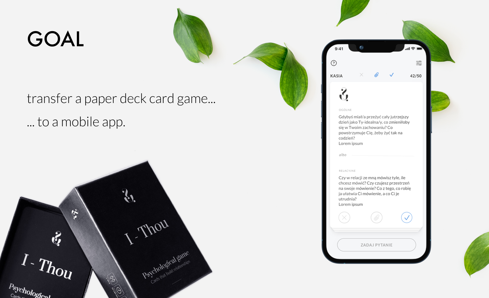
The project involved adapting a psychological game, originally played with a deck of therapeutic paper cards, into a mobile application.
The app is designed for both therapists and individuals seeking to deepen their relationships or expand their self-awareness.
Challenges:
○ The original product (paper cards) had not been tested before its market release.
○ Because the cards already existed and their gameplay was established, the game mechanics could not be altered (e.g., the game requires players to follow a specific order).
○ We faced a limited budget, which initially restricted our research to surveys and informal corridor testing. Additionally, budget constraints necessitated the development of a multiplayer game that could only be played locally on a single device, rather than an online version.
My role was to design the game mechanics and user interface to closely replicate the client’s original gameplay concept as used with the paper cards.
Empathise and define
We started by using the existing cards, playing several games according to the provided instructions. This process helped us understand both the players' needs and the client's objectives.
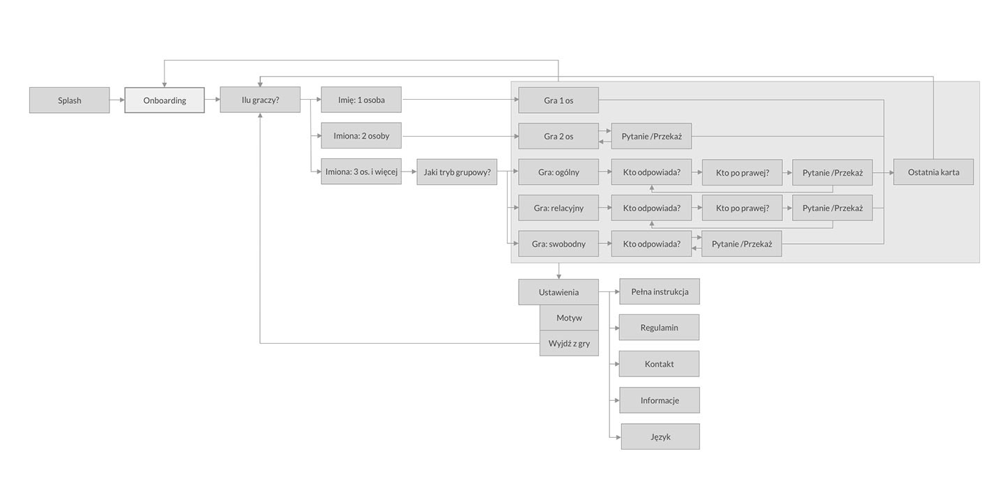
The next step was research: we analysed existing card-based and psychological apps. Based on these insights, I created initial paper sketches of the app and mapped out the first user flow.
Ideate
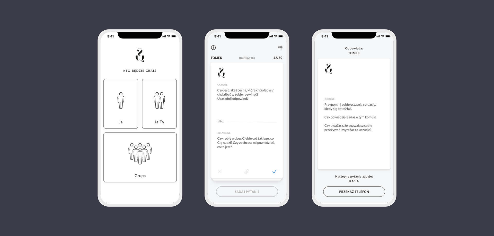
I create mockups of individual screens and the interface design in Sketch. As the users should focus more on their internal experience while reading the questions, I try to make a minimalist interface.
Prototype
The assets were handed over to the developer who created the application prototype - initially in the online version. After internal testing and several iterations, we created the MVP version, which also underwent internal testing first, and after a few more iterations, we decided to test it on a small group of external users.
Tests
The MVP version of the application was made available to 25 people. We asked them to install and play freely for two weeks. After this time, we sent a questionnaire to the test group. We ask if the application was helpful, the situations in which they used the app, the gameplay and its appearance. We also asked what the users were missing and what they would improve in the current version.
Sample questions:
○ Was the application helpful?
○ How do you rate the difficulty of using the app? (from 1 to 5, where 1- is very difficult and 5 - very easy).
○ How did you use the app? (in what situations, with whom?)
○ Are there any missing features that you would like to add? What?
○ What was the most difficult for you, and what was incomprehensible?
Twenty-two people responded to our survey. Based on their responses, we drew conclusions that allowed us to improve the smoothness of the game.
Changes and optimisation
The main changes after the testing phase were:
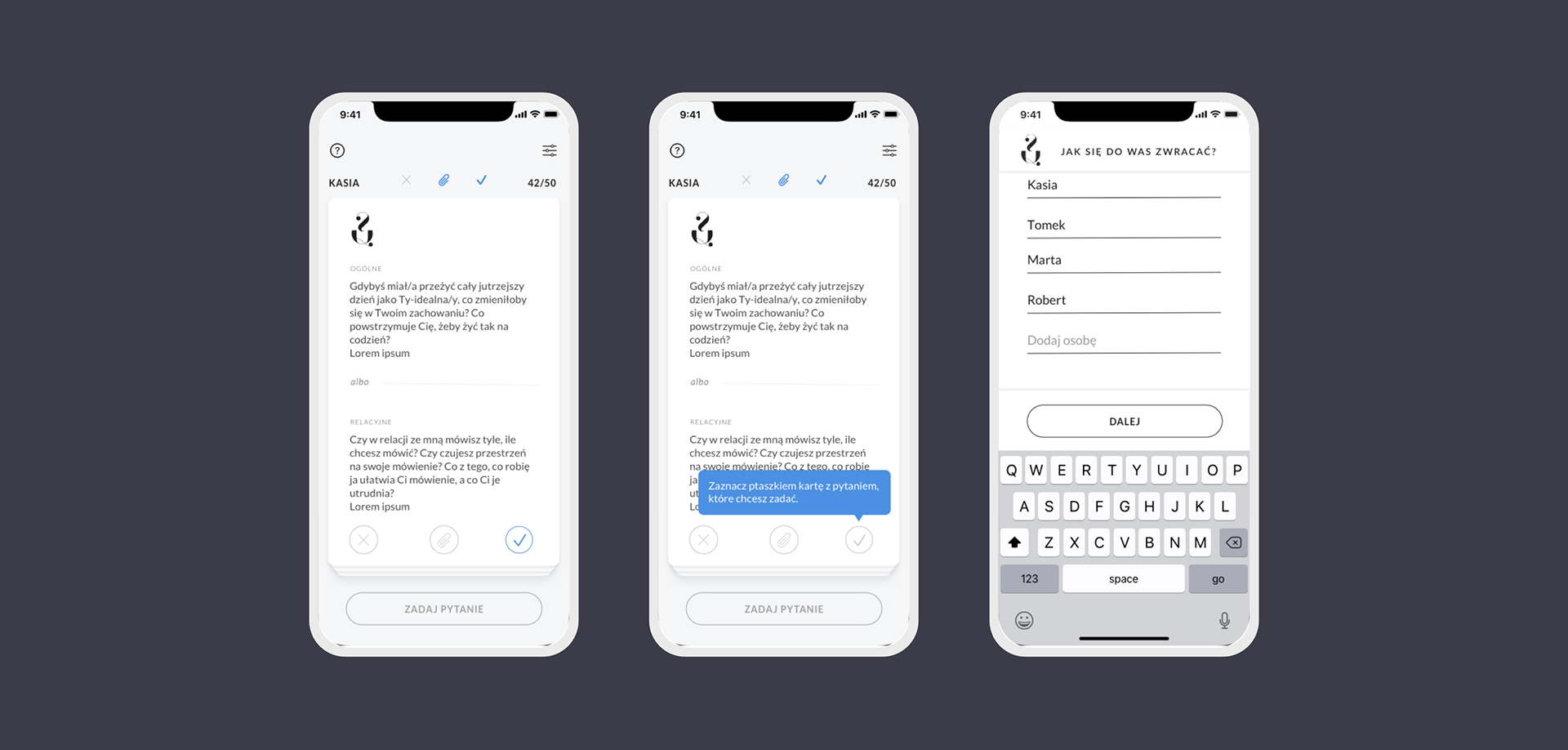
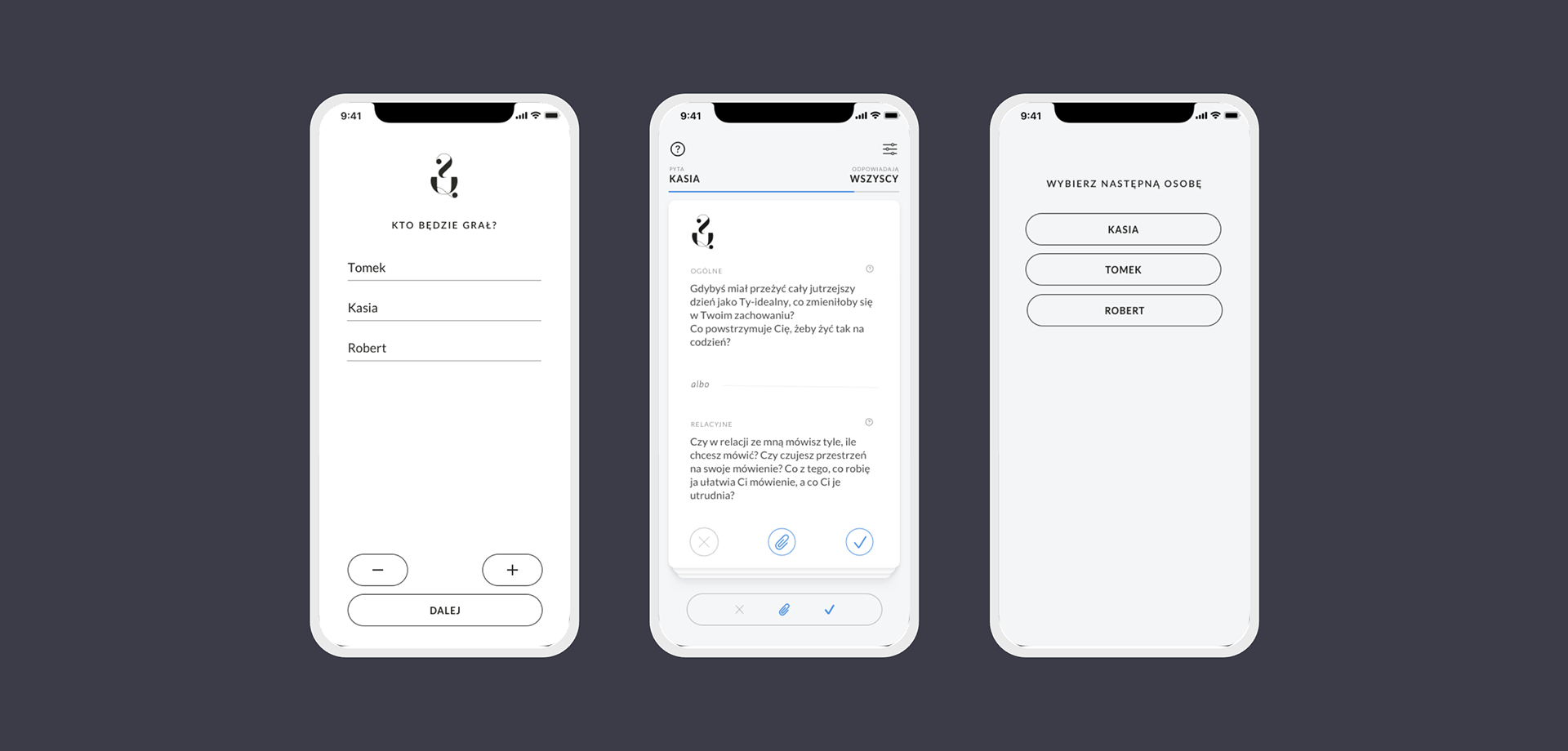
○ Shortening the onboarding process - The game mechanics are somewhat complex, which initially resulted in a long onboarding process. Based on testing feedback, we broke the onboarding into smaller sections and replaced some static screens with dynamic tutorials.
○ Redesigning the buttons on the cards - Originally, we used only icons, which some players found unclear. We updated the design so the buttons now look and function like actual buttons.
○ Adding an indicator for selected cards - The card status alone wasn’t clear enough for all players, so we introduced a visible indicator for selected cards.
○ Saving the first player’s name - Typically, the phone owner is the first player, so we added functionality to remember their name for convenience.
○ Updating the player addition process - Instead of asking players to enter the number of participants at the start, we switched to a dynamic player-adding feature.
Next iterations
In subsequent iterations of the project, we made the following changes:
○ Updated the player addition method - Due to limitations in Unity, we switched to adding players using a “+” button.
○ Remembering players in a group - Test users often played with the same partner. Retaining player names across screens made it faster to remove or adjust players, rather than having to re-enter them each time.
○ Moved the selected card indicator to the button - Placing the indicator closer to the action follows Fitts' Law and improves usability.
○ Redesigned player selection screens - We replaced the pop-up list with a dedicated screen containing buttons, which improved both readability and interface consistency.
○ Replaced the card/turn counter with a progress bar - The previous display of the number of cards or turns was unclear to most testers; the progress bar provided a more intuitive visual cue.
Want to know more?